🚨 When Payments Fail, UX Gets Tested
As a UX designer, I often pay attention to the smallest digital interactions—especially when things don’t go
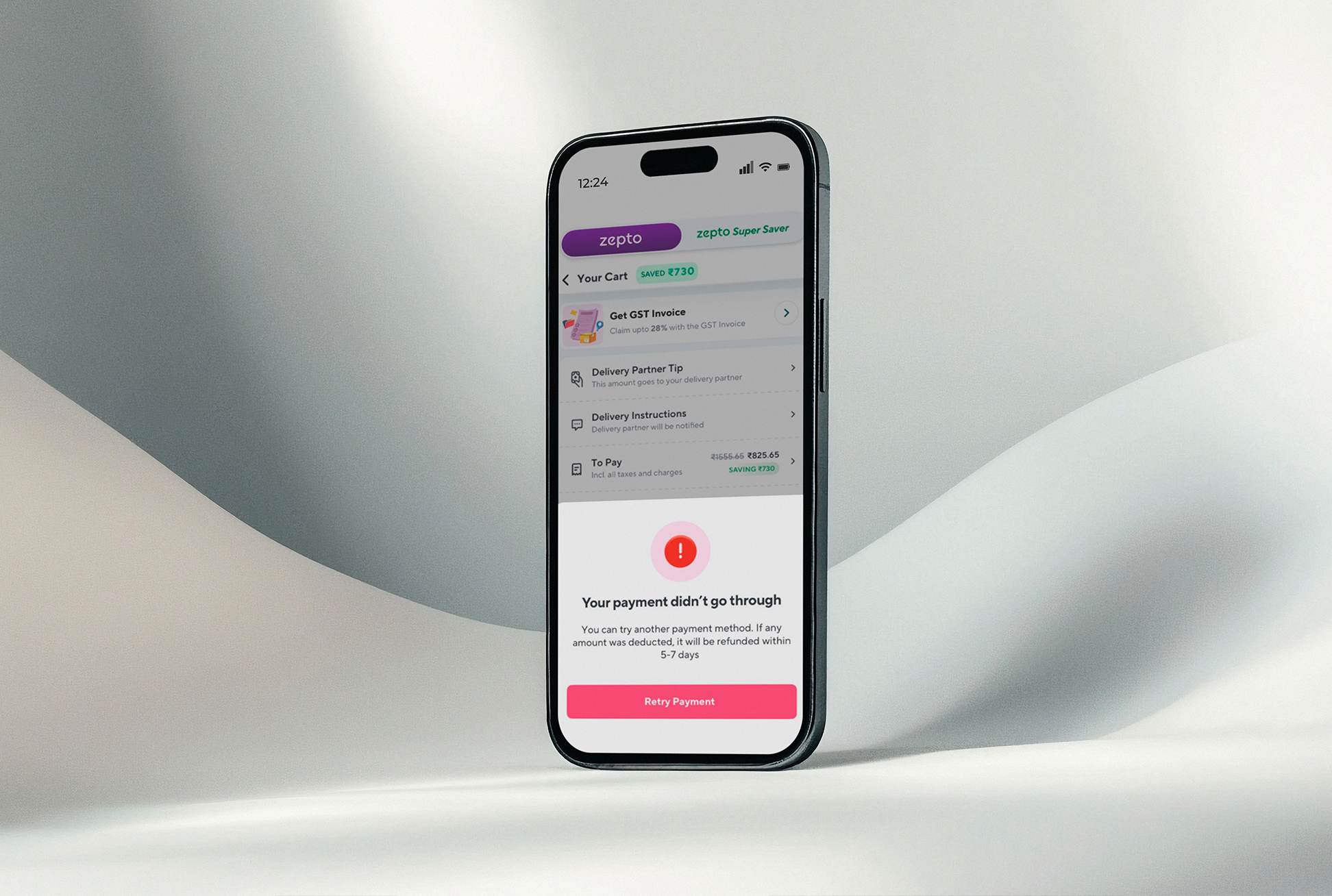
as planned. A few days ago, I was ordering groceries on Zepto, and just as I tried to pay, the transaction
failed. My bank's server was temporarily down.
Out of curiosity (and instinct), I opened Swiggy Instamart and tried the same thing. The result? Same issue
— payment failure. But the user experience was miles apart.
💡 Same Problem, Better UX
Both platforms encountered the same technical error, yet Swiggy handled it in a way that felt smoother,
clearer, and more reassuring.
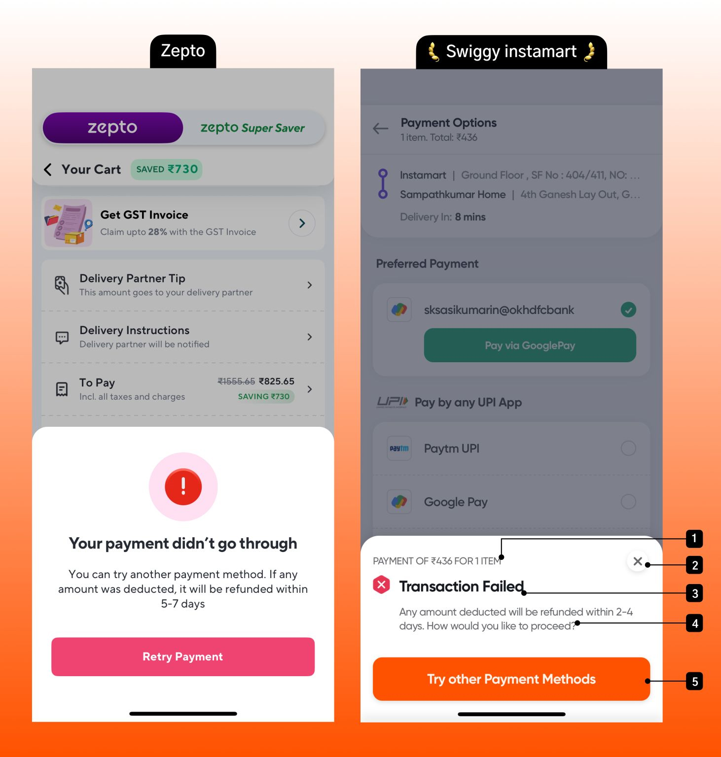
Here’s a breakdown of what they did right — and what Zepto missed:
1. Clear Context
“Payment of ₹436 for 1 item.”
Swiggy immediately lets users know what failed — not just that something failed. This tiny piece of context
eliminates confusion and builds user confidence. Zepto’s message? Just a generic error with no detail.
2. Easy Exit
A clearly visible Close (X) icon
Swiggy offers users a clean way to exit the failed state. This may sound minor, but giving users control
during failure moments reduces frustration. Zepto’s modal lacked this clarity, which can leave users feeling
stuck or helpless.
3. Straightforward Heading
“Transaction Failed.”
No fancy language. No vague error codes. Just a clean, honest message. This builds trust. Users don't want
euphemisms or fluff when something breaks — they want transparency. Swiggy delivers that.
4. Reassurance Matters
“Any amount deducted will be refunded within 2–4 days.”
That single line makes all the difference. Users immediately know their money isn’t lost, and a clear
timeline reduces anxiety. Zepto does mention refunds, but in smaller text and less specific wording — which
creates uncertainty.
5. Clear Next Step
“Try other payment methods”
Swiggy gives a clear, actionable path forward. No ambiguity, no circular loops. In contrast, Zepto just
offers a “Retry Payment” button, which can feel like a gamble when users don’t know if the issue is resolved
yet.
🔍 Why This Matters in UX
These details may seem small — but in the world of UX, micro-moments define brand trust. Failure states are
often overlooked, yet they’re when the user feels most vulnerable. A well-designed failure screen turns
frustration into reassurance, showing users that your product is dependable, even when things go wrong.
Swiggy's attention to these moments demonstrates a mature UX mindset — where the user journey is cared for
at every touchpoint, not just during ideal flows.
🟢 UX Takeaway
Great UX isn’t just about delight. It’s about resilience.
Designing for edge cases and failure states is just as important—if not more—than designing for the “happy
path.”
👏 Hats off to the Swiggy Instamart design team for showing us how it’s done.
For designers, PMs, and product teams — this is your reminder:
Don’t skip the failure flows. That’s where trust is built.
DesignForTrust
SwiggyUX
ZeptoUX
Leave A Reply
Your email address will not be published. Required fields are marked *